
The Unigrid Brochure
Redesign
About the Project
For my senior capstone, I redesigned the National Park Service’s Unigrid brochure system to create a more cohesive and user-friendly experience across all parks. The updated design establishes a flexible yet standardized template that any designer—from any park—can easily open and use to produce a publication that aligns visually and structurally with brochures from other parks. To improve usability, I focused on shortening text sections for quicker readability, making it easier for visitors to find essential information at a glance—especially important in the outdoor, on-the-go context these brochures are used in. I also incorporated QR codes and modern design elements to streamline navigation and integrate digital access, enhancing the overall visitor experience while preserving the iconic Unigrid identity.
The Result


The Process
Brand Research
BRAND RESEARCH
To kick off the project, I conducted extensive research into the National Park Service’s Unigrid brochure system, diving deep into its origins, purpose, and legacy. I closely studied the official design guidelines—revisiting them repeatedly until I had memorized key measurements, layout rules, and typographic standards. I also analyzed a wide range of existing brochures from different parks to identify patterns, inconsistencies, and opportunities for improvement. This research grounded my redesign in the system’s core principles while giving me the insight needed to modernize it for today’s users.
For the project, I picked five posters to redesign that I thought were vastly different from one another and covered a wide hodge-podge of information.
I then did verbal and online research to identify which key information people found valuable to include on these brochures.
After mastering the original 1977 guideline standards, I started learning about the 2001 update to the Unigrid guidelines in Director's Order #52B - Graphic Design Standards


1977 Standards
2001 Update
Director's Order #52B
Director’s Order #52B
During the process, I uncovered that there was a 2001 update to the Unigrid guidelines, outlined in Director’s Order #52B – Graphic Design Standards. This revision introduced several key changes, including updated specifications for park name sizing, the addition of park location and site designation details, and the required inclusion of departmental and National Park Service emblems. It also marked a major typographic shift—replacing Helvetica and Times New Roman with Frutiger and NPS Rawlinson—and standardized paragraph formatting to rag right for improved readability. I developed a new version of the design that implemented these updates, ensuring alignment with the current standards while preserving the Unigrid’s visual heritage, and kept the old design for comparison as well.
Final Adjustments were made to the layout and content, and some posters' layouts were altered for variation between the series of five posters.
Version 1
V1
To begin, I reconstructed the Unigrid system based on the original 1977 National Park Service guidelines, which were both extensive and highly precise. This foundational framework set the stage for consistency and structure across the entire redesign. Once the grid was in place, I began mapping out modular content blocks—flexible containers for key information—and tested how much space could be allocated to each section. This phase focused on spatial planning and composition, experimenting with hierarchy and proportion while beginning to introduce images to assess overall visual balance.
Copy was filled in and QR codes created for a link back to recreation.gov


Versions 2-3
V2 & V3
After working within rigid content containers, I realized that the design felt overly constrained. Upon revisiting the 1977 guidelines, I interpreted that while the grid provided structure, the intention wasn’t to box in the content—but to guide it. As long as spacing and alignment principles were respected, there was room for a more fluid, organic layout. With this understanding, I developed a second and third version that allowed content to breathe more naturally across the spread, resulting in a designs that felt less mechanical and more inviting, while still honoring the Unigrid’s core structure. It took several iterations to get a good "feel" that wasn't too crowded and didn't leave too much space open.


Final Delivery
FINAL DELIVERY
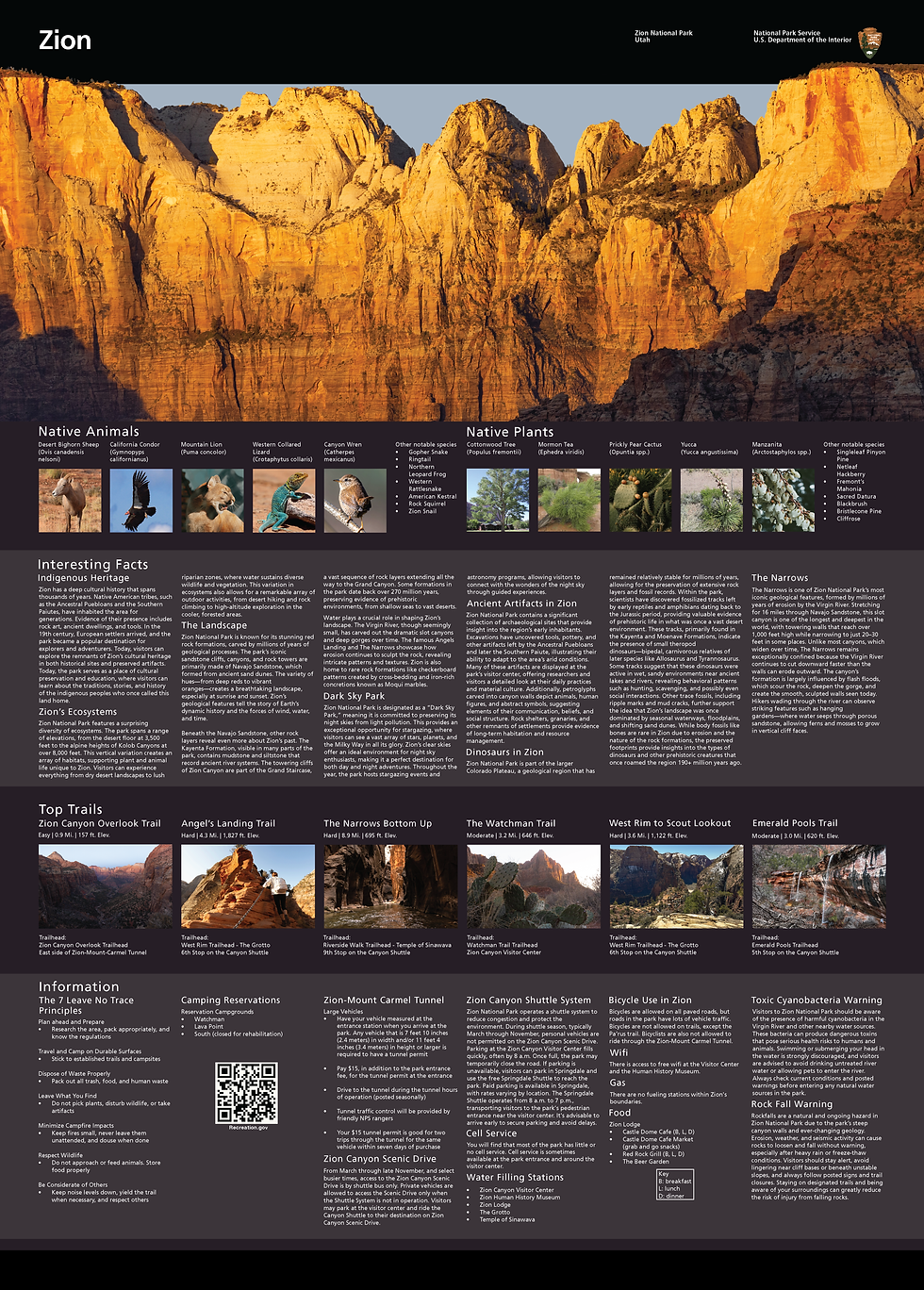
As part of the final submission, I produced two digital versions of each brochure—one designed according to the original 1977 Unigrid guidelines and the other following the updated 2001 standards—for five national parks: Arches, Yosemite, Glacier, Great Sand Dunes, and Zion. This allowed for a direct comparison of how the same content could be interpreted through different eras of the Unigrid system. For the physical submission, I selected the 2001 guideline versions to produce as large-format printed posters, showcasing the most current and officially recognized design standards in practice.


Presentation
This Section Coming Soon
This Section Coming Soon